Design Purpose
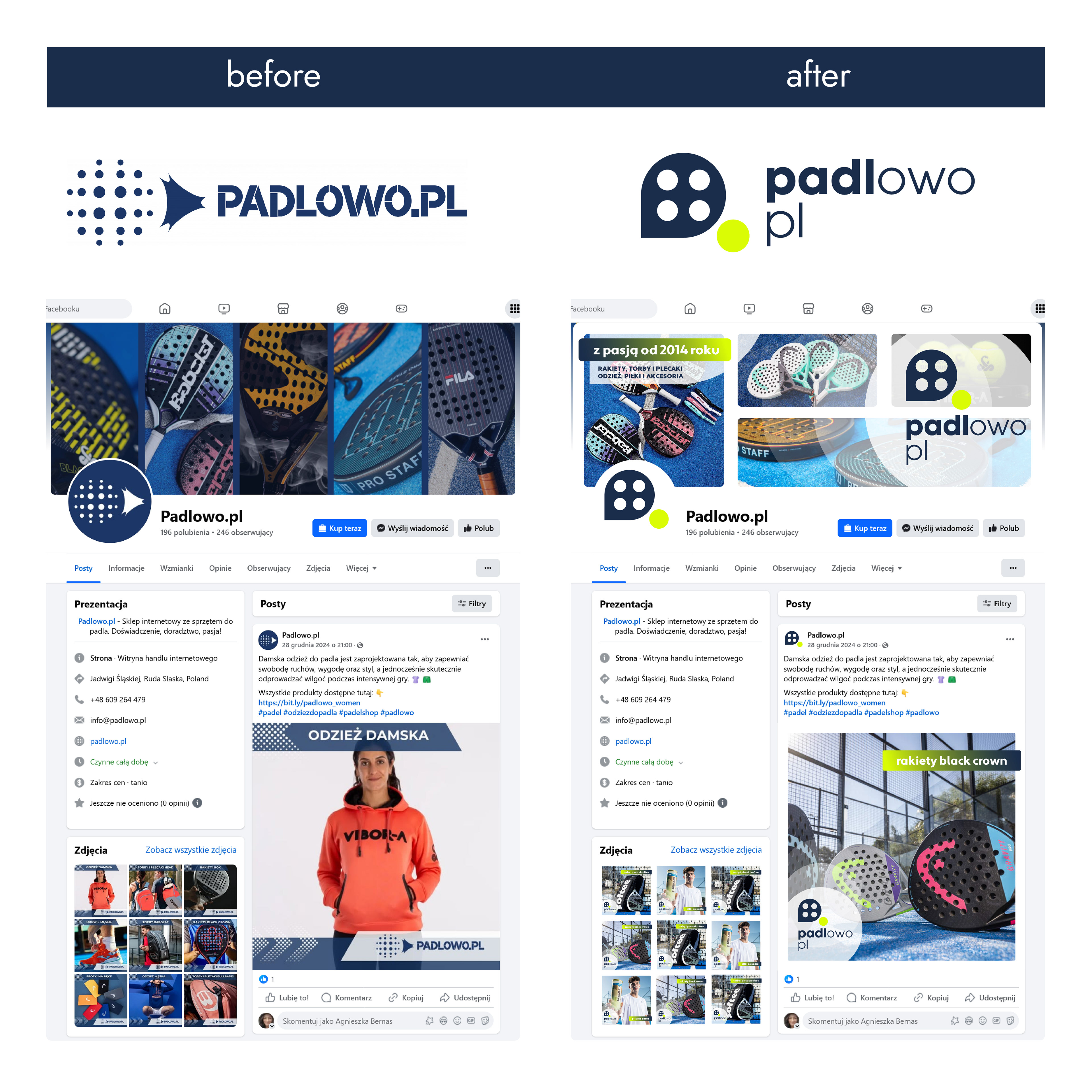
The purpose of the redesign was to simplify and refine the visual identity of an online store dedicated to the padel community.
The logo needed to become more legible, contemporary, and better suited for digital environments while maintaining a clear sports-oriented character.
Design Approach
The project focused on reducing visual complexity and improving the logo’s functionality. Instead of illustrative solutions, the design moved towards a clear, geometric construction that performs well at small sizes and across online touch points.
Design decisions were guided by recognizability, clarity, and ease of use in e-commerce contexts.
Visual System
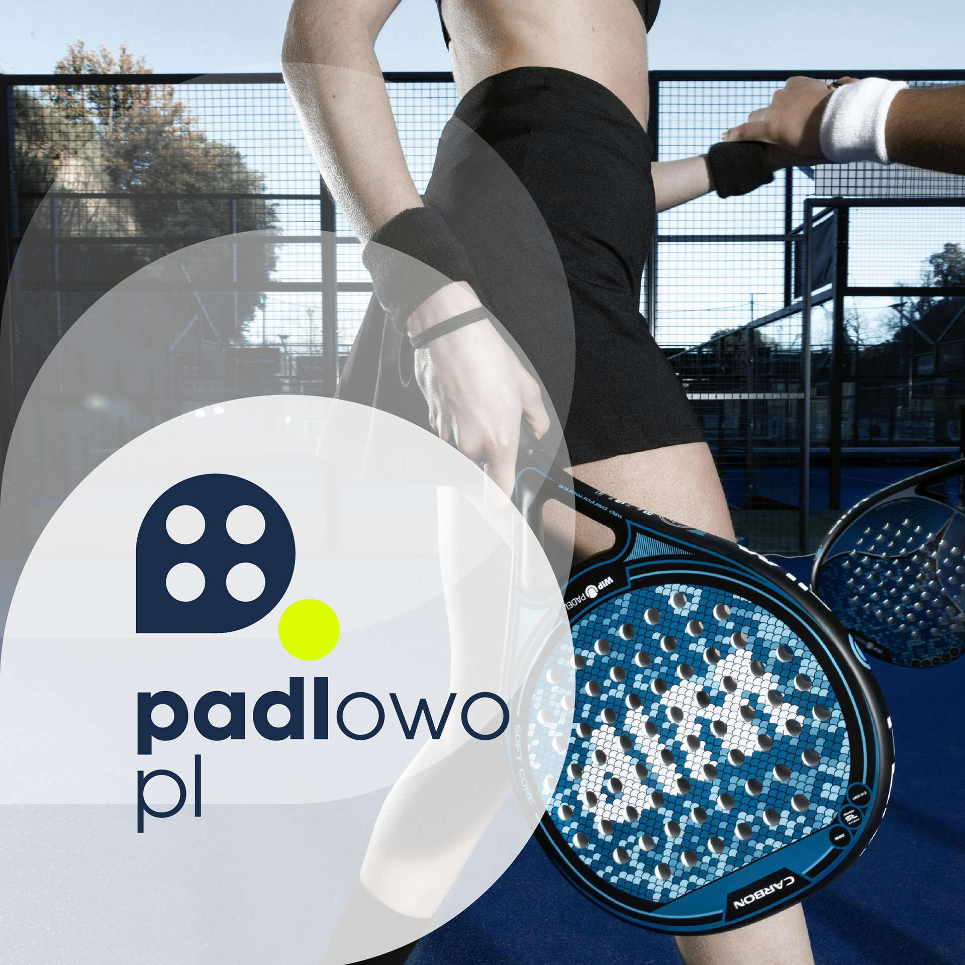
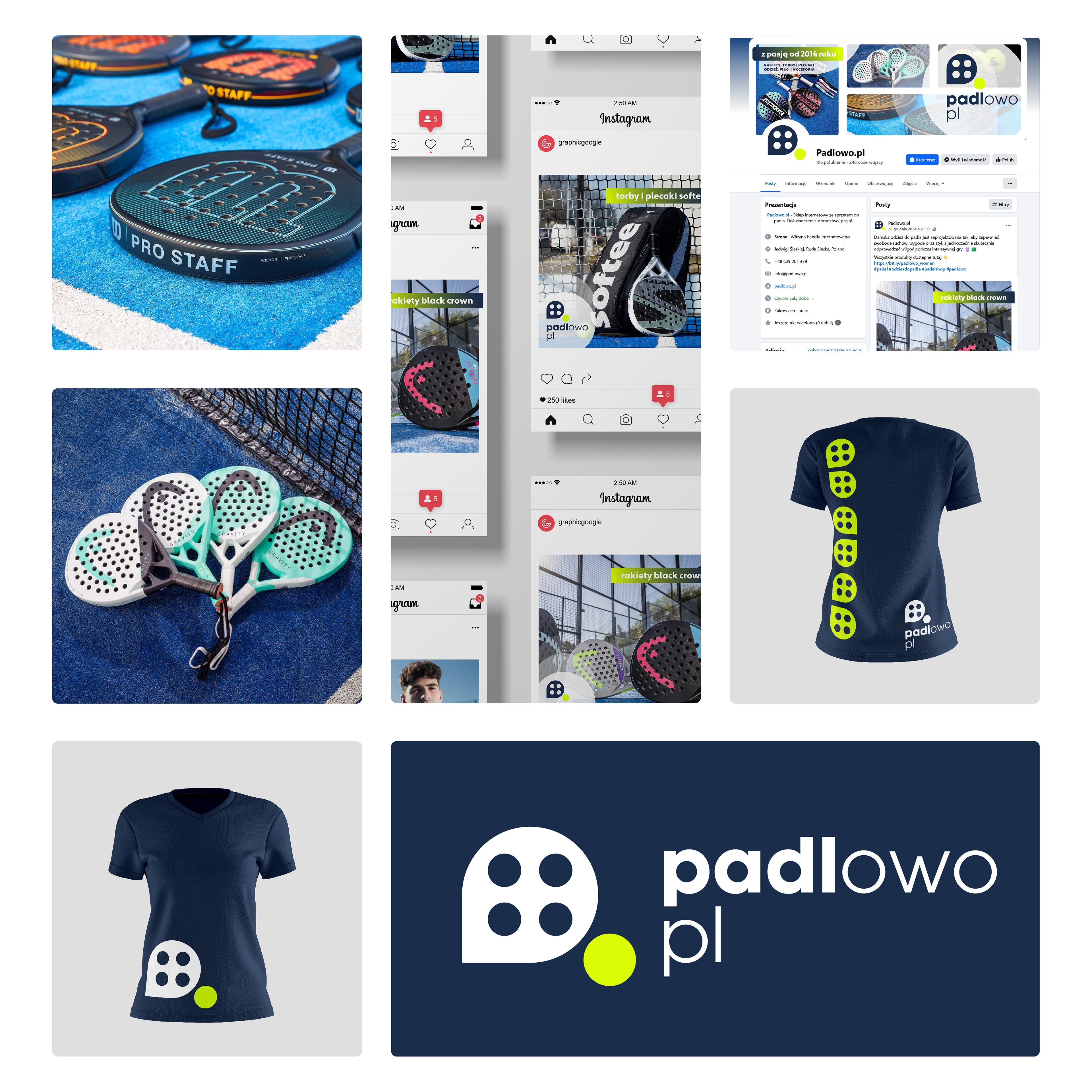
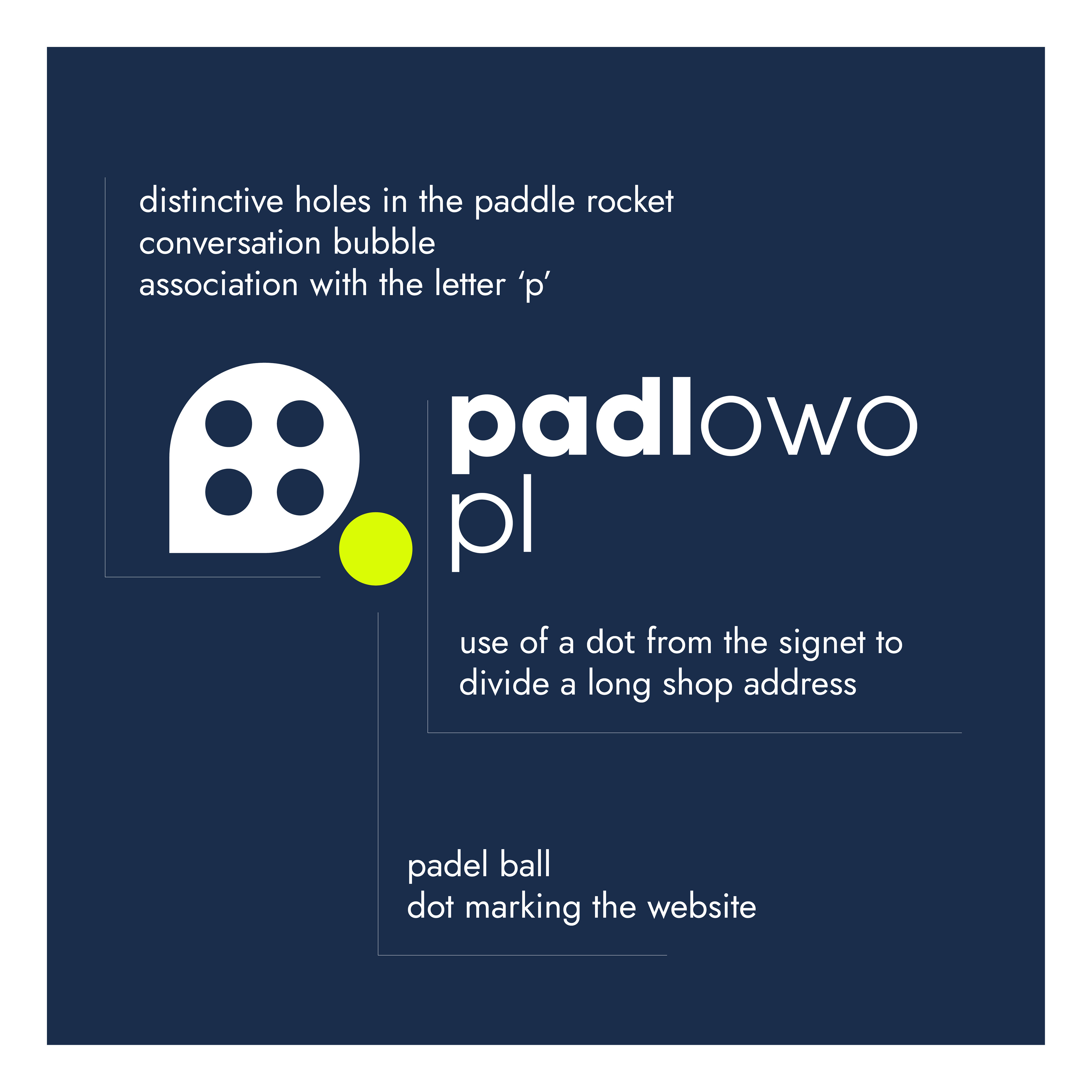
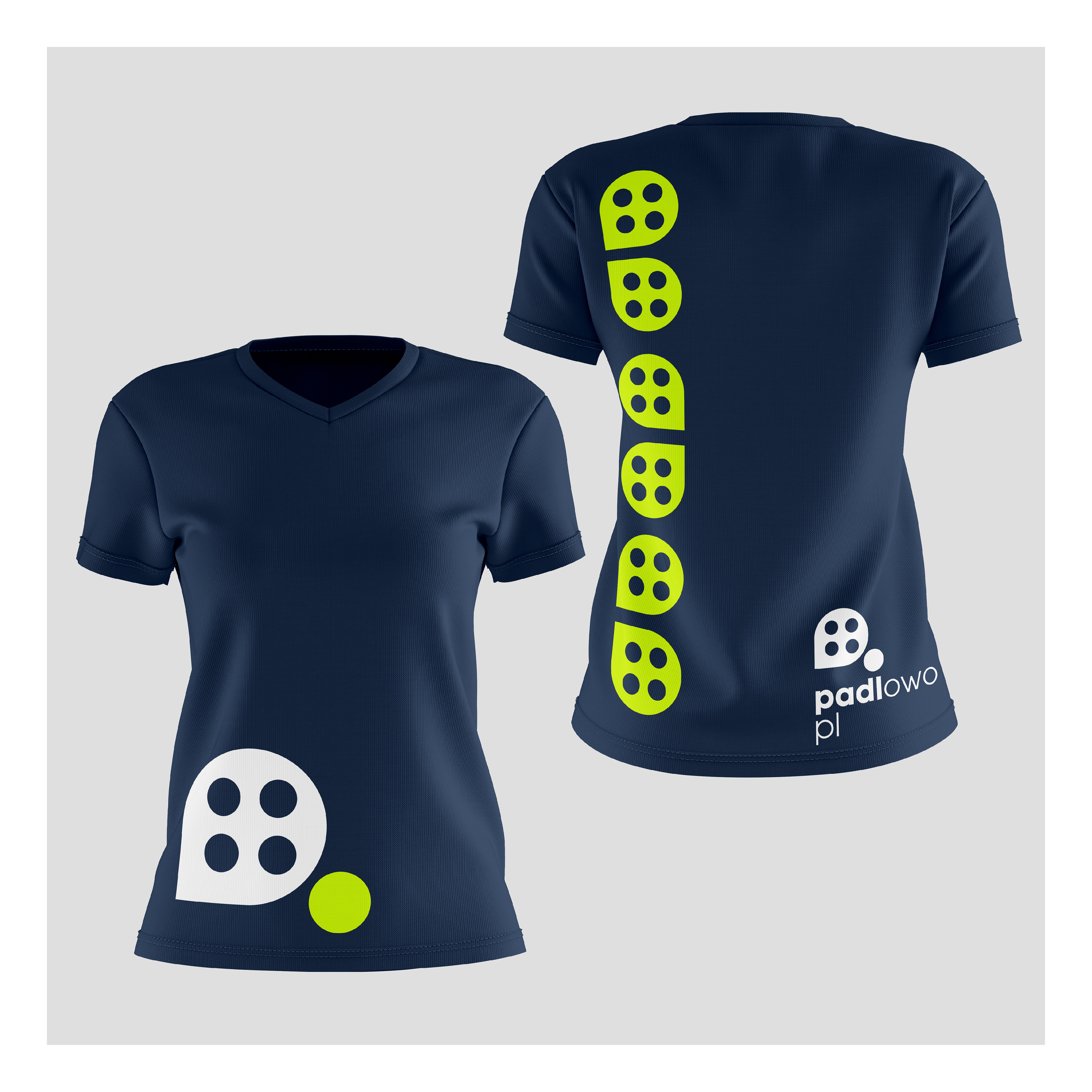
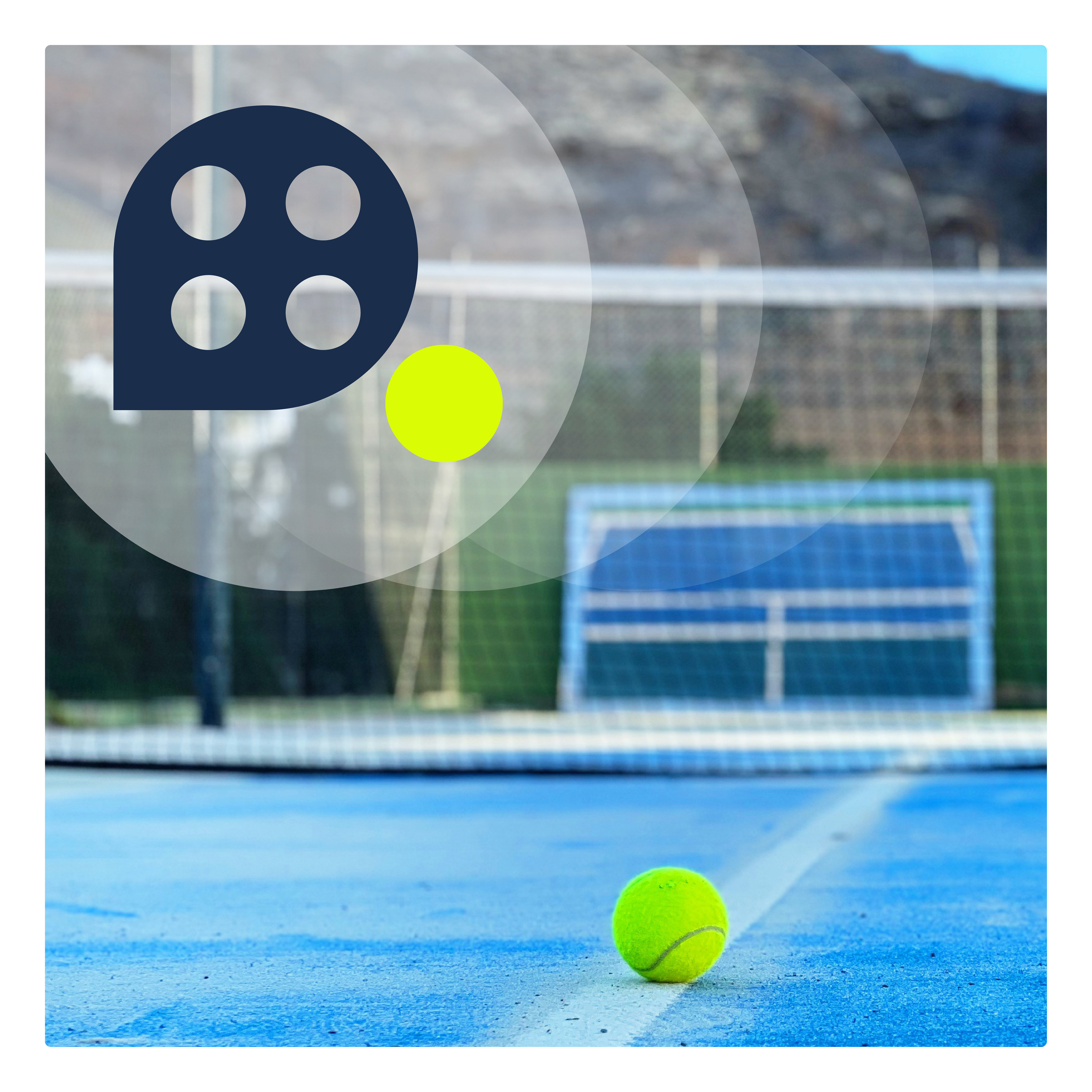
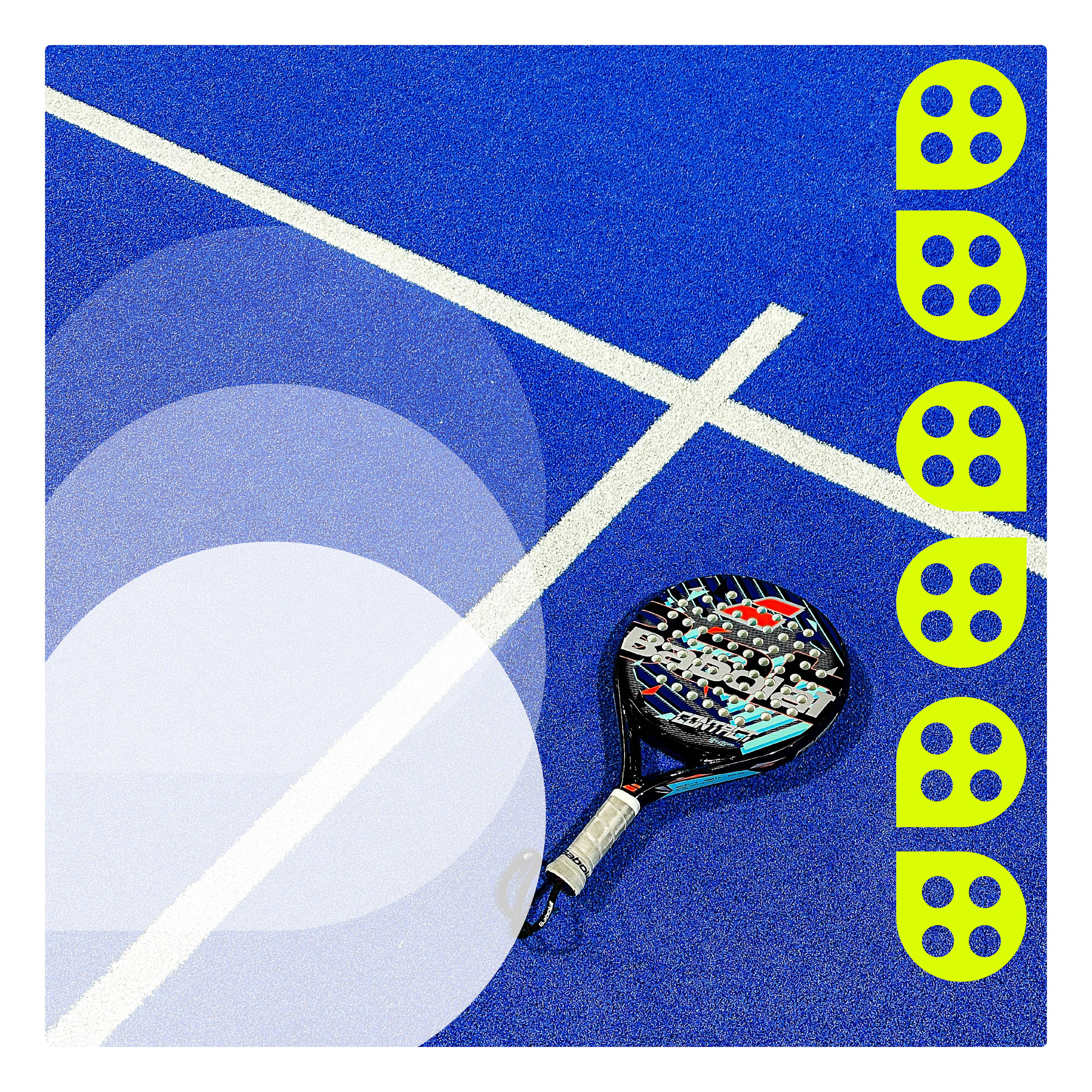
The logo was designed as a compact, legible mark based on strong typography and simple geometric forms.
The color palette supports a dynamic, athletic feeling while remaining effective within digital interfaces.
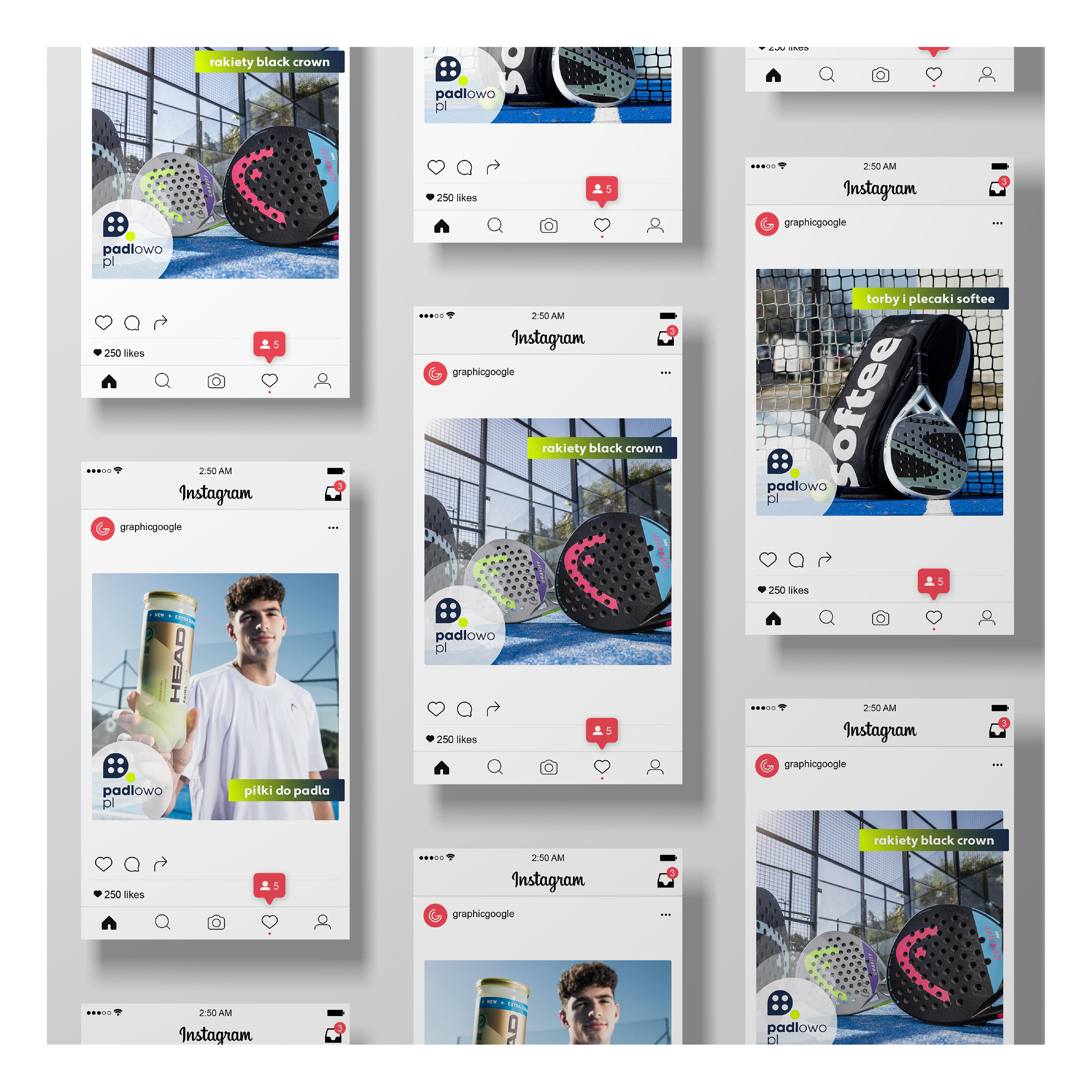
The system allows consistent use across the online store, promotional materials, and social media.
Outcome
The result is a modern, functional logo that strengthens the store’s professional image and improves brand clarity in digital space.
The redesign provides a solid foundation for further development of Padlowo’s visual identity.