Design Purpose
The goal was to create a visual identity for a construction company that communicates professionalism and reliability while standing out in a sector dominated by heavy, literal symbolism.
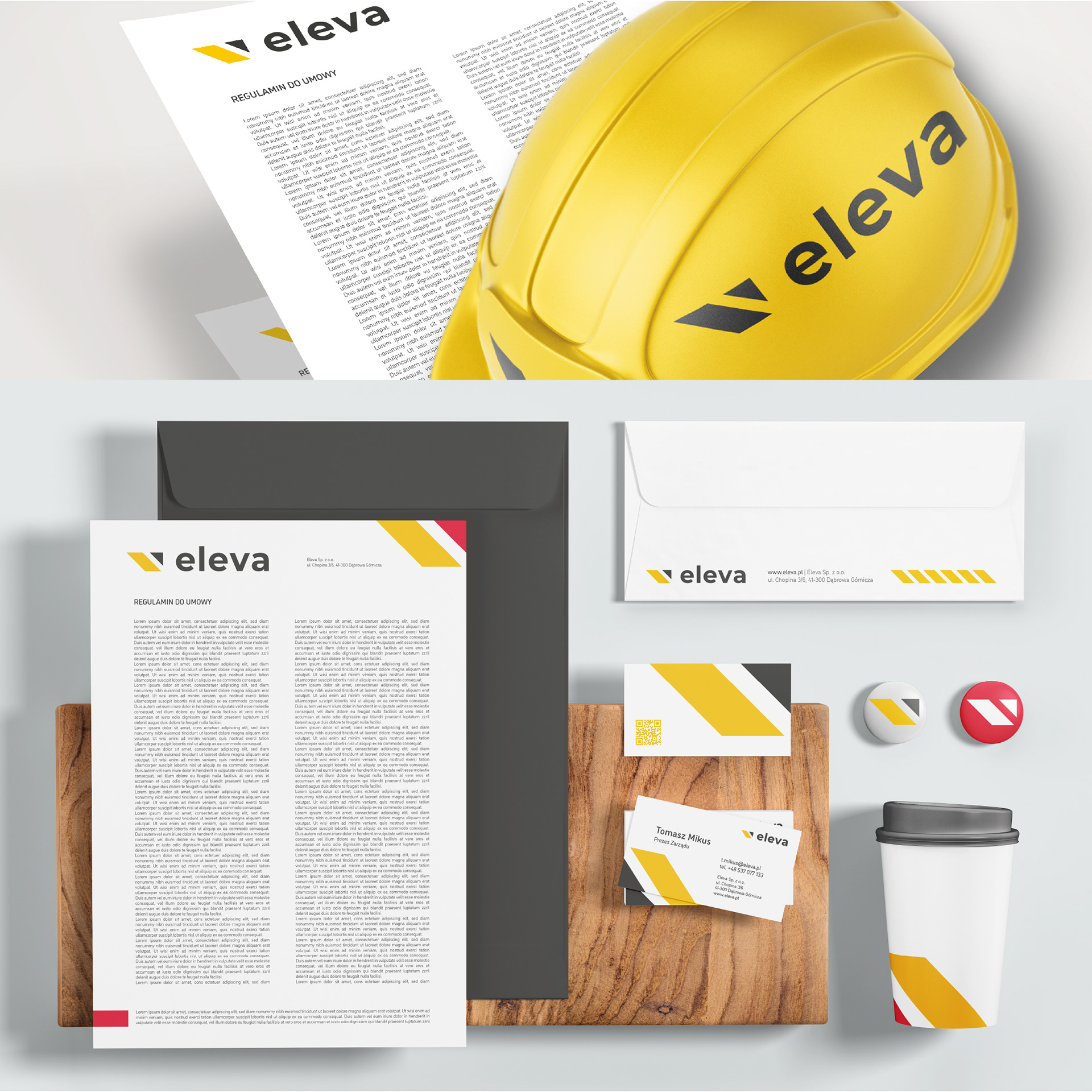
The system needed to be clear, scalable, and easy to use across everyday applications.
Design Approach
The identity was built on simple, precise forms and clear relationships among elements.
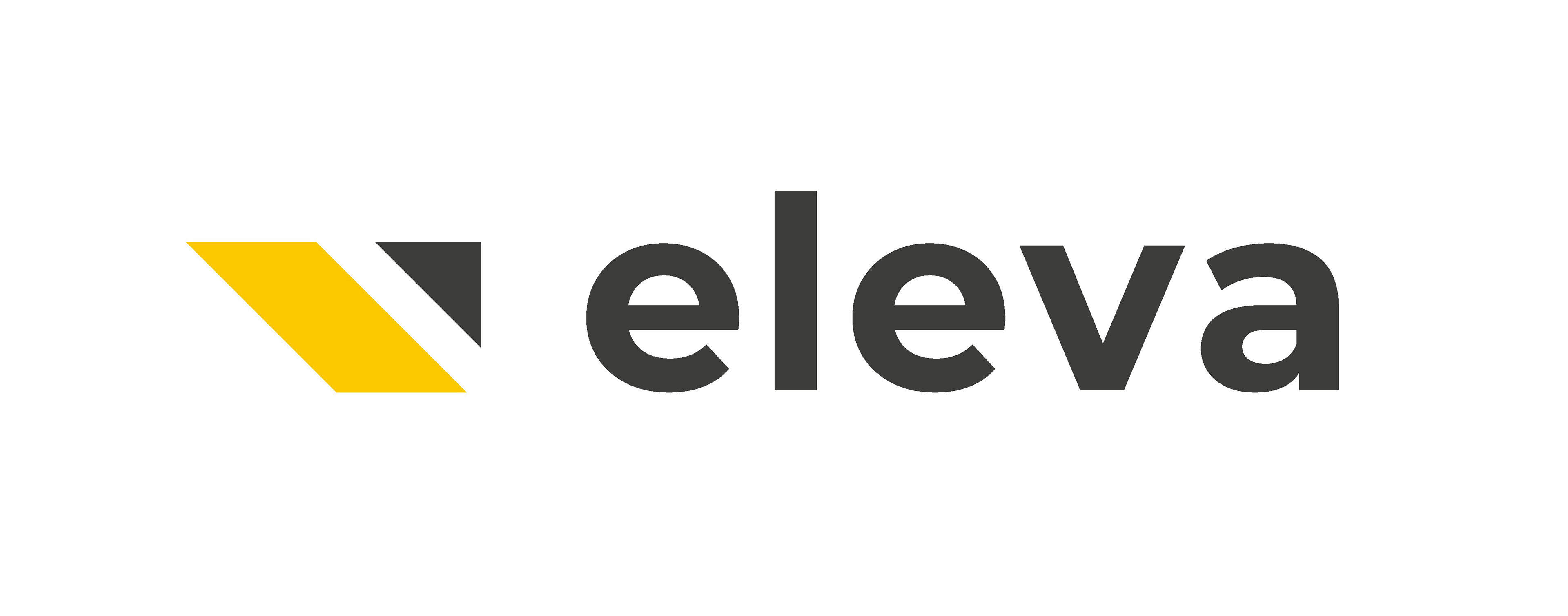
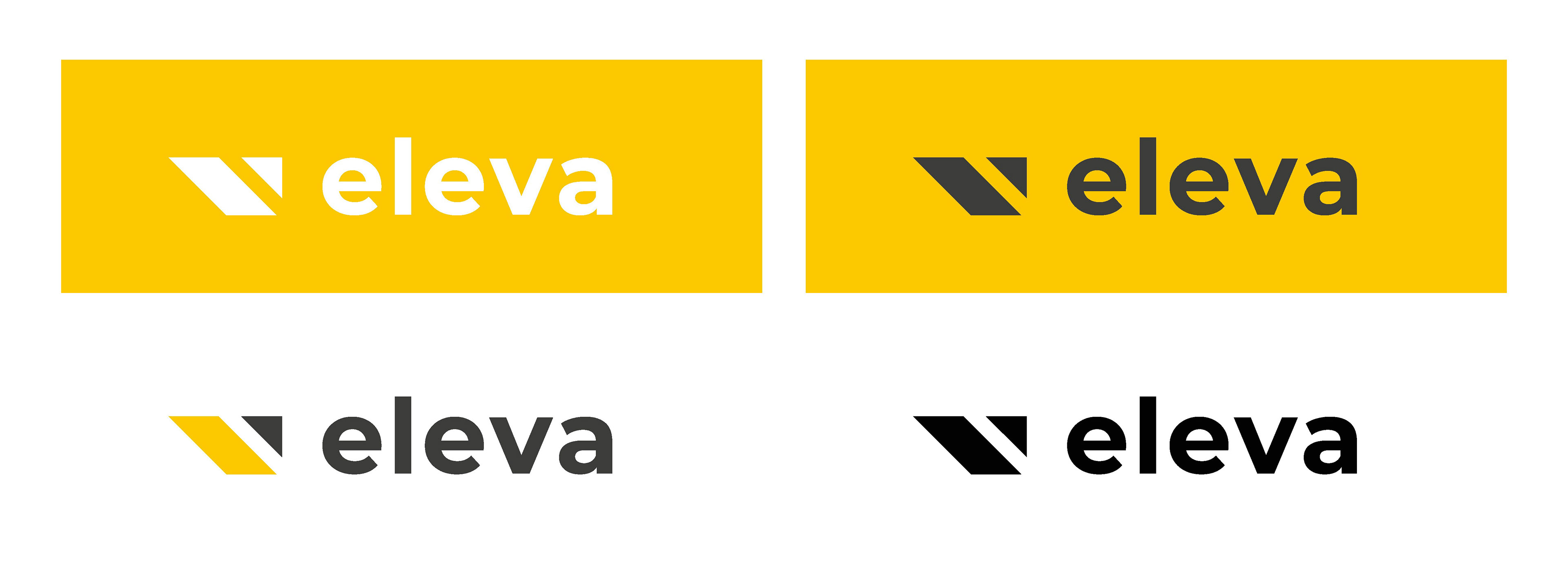
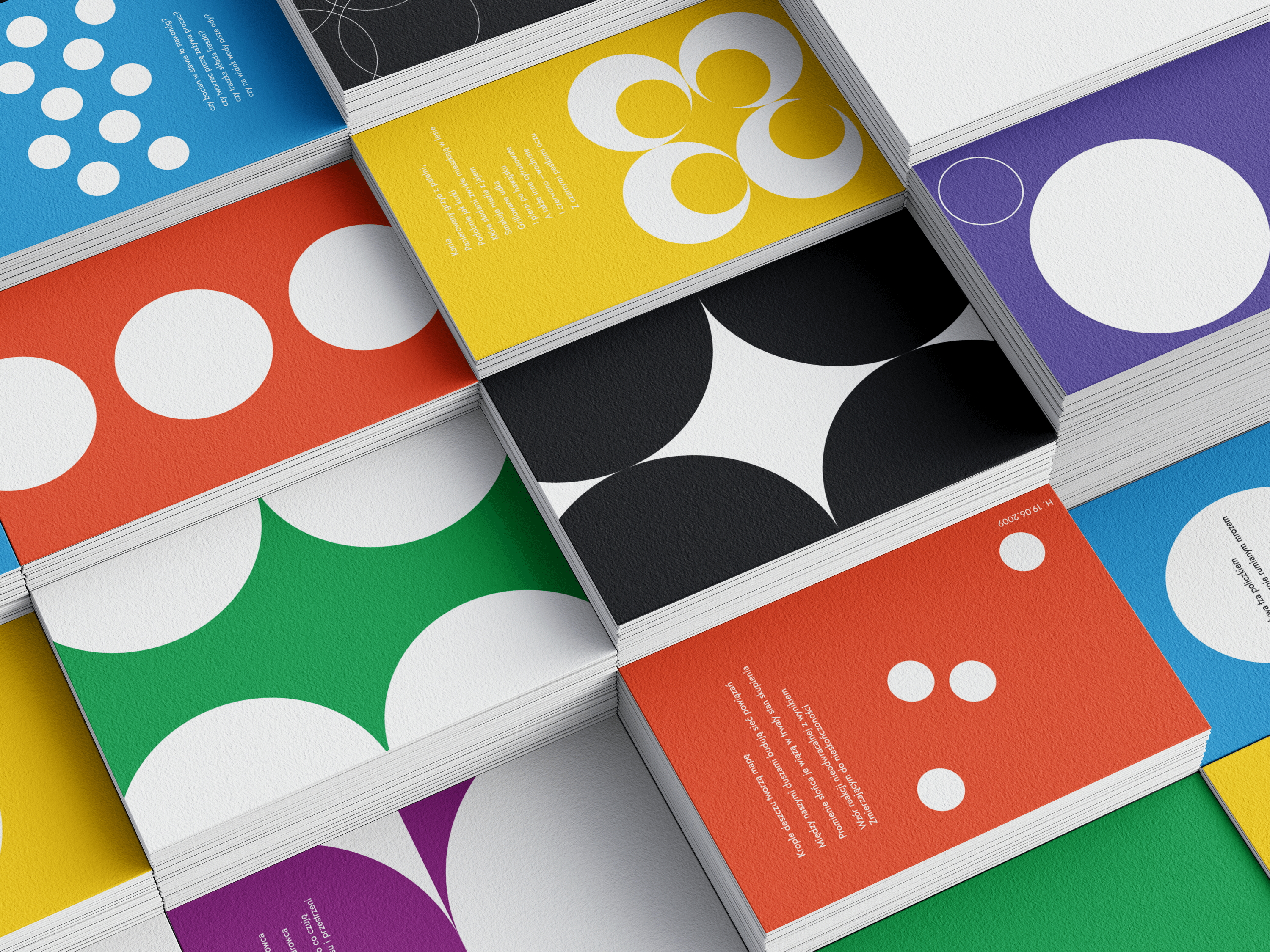
The yellow shape not only refers to the client's construction needs but is also a color commonly associated with the industry. The dark triangle shape displays growth progress and development.
Visual System
The grey color, shared by the logo typography and the symbol, establishes a consistent sense of professionalism and stability, while the yellow color draws attention and strengthens recognition.
The system is based on a geometric mark, a clean sans-serif typeface, and a straightforward modular layout, ensuring consistency across formats and scales.
Outcome
The result is a durable, functional visual identity that clearly communicates the brand’s image and supports flexible use across corporate materials, spatial applications, and everyday touch points.
Client Perspective
CEO of Eleva Sp. z o.o.: Working with the owner of the studio was an absolute pleasure and a true display of professionalism. Despite the very tight deadline, Agnieszka prepared a detailed schedule, took full ownership of the project, and completed it ahead of time. Excellent communication, professionalism, and strong expertise are three qualities that perfectly summarize our collaboration. Highly recommended.