Challenge
To design a comprehensive historical publication documenting the symbols of Kraków - combining academic rigor, archival material and visual clarity.
The challenge lay in structuring complex, image-heavy content while maintaining hierarchy, readability and conceptual coherence.
Solution
Art direction focused on defining a strong, disciplined layout system that could support dense historical material without simplifying it.
The visual structure was treated as an active framework, shaping not only design decisions but also influencing editorial adjustments to ensure consistency and clarity.
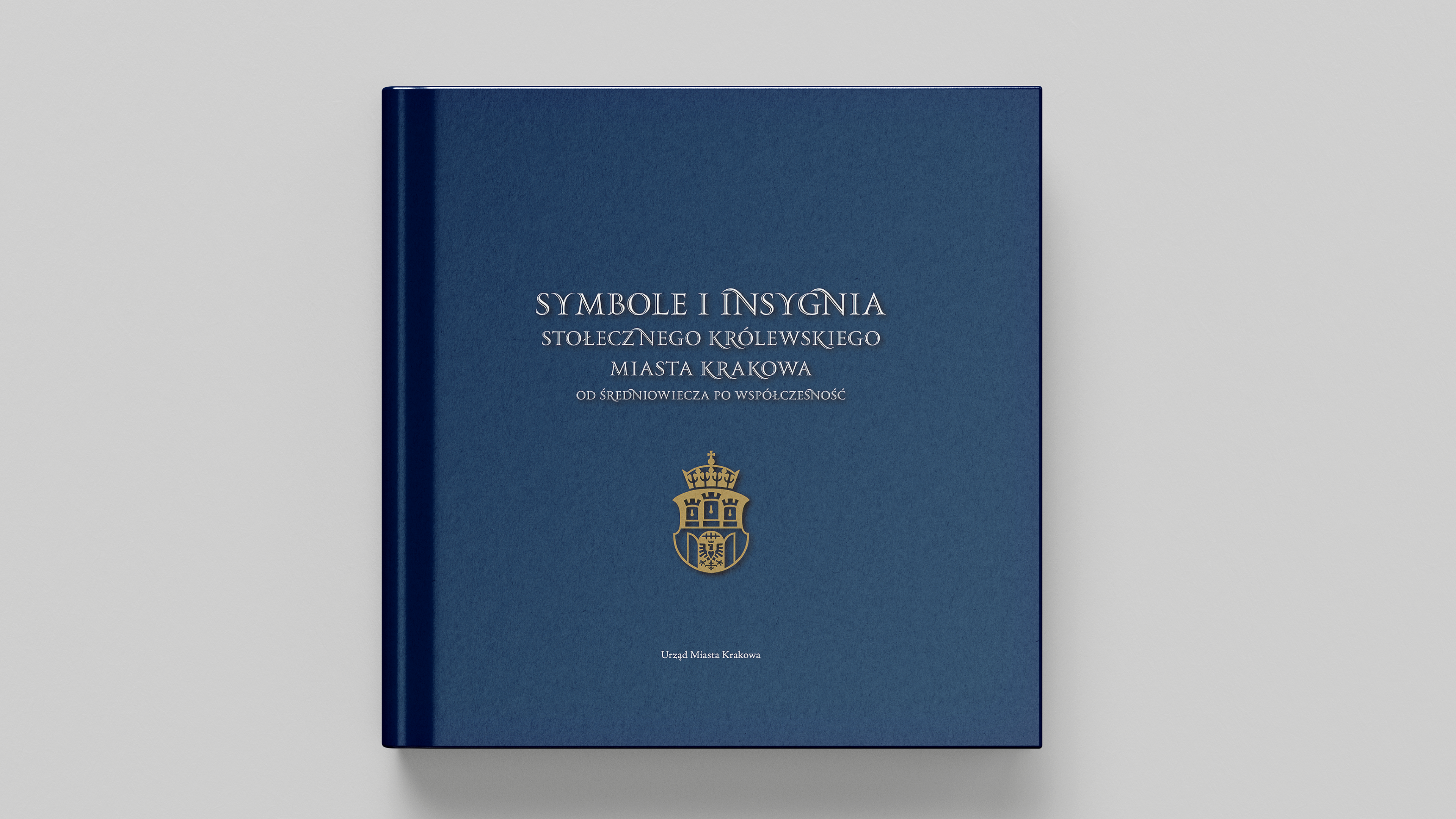
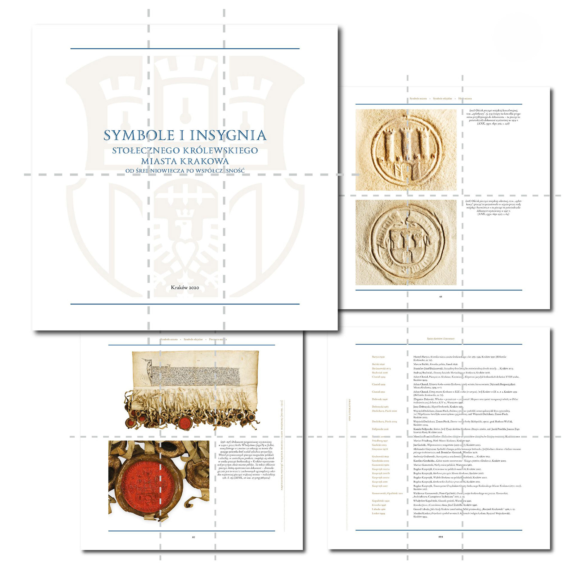
Design system
A restrained, grid-based layout establishes order and rhythm across extensive content.
Typography, spacing and image placement were carefully calibrated to balance narrative flow with scholarly precision, allowing visual structure to guide interpretation.
Outcome
The project resulted in a coherent, authoritative publication where visual order reinforces content rather than decoration.
Art direction played a key role in aligning design and editorial perspectives around a shared, demanding visual standard.
Disciplines
Art Direction, Publication Design, Editorial Design, Visual Systems, Print Production


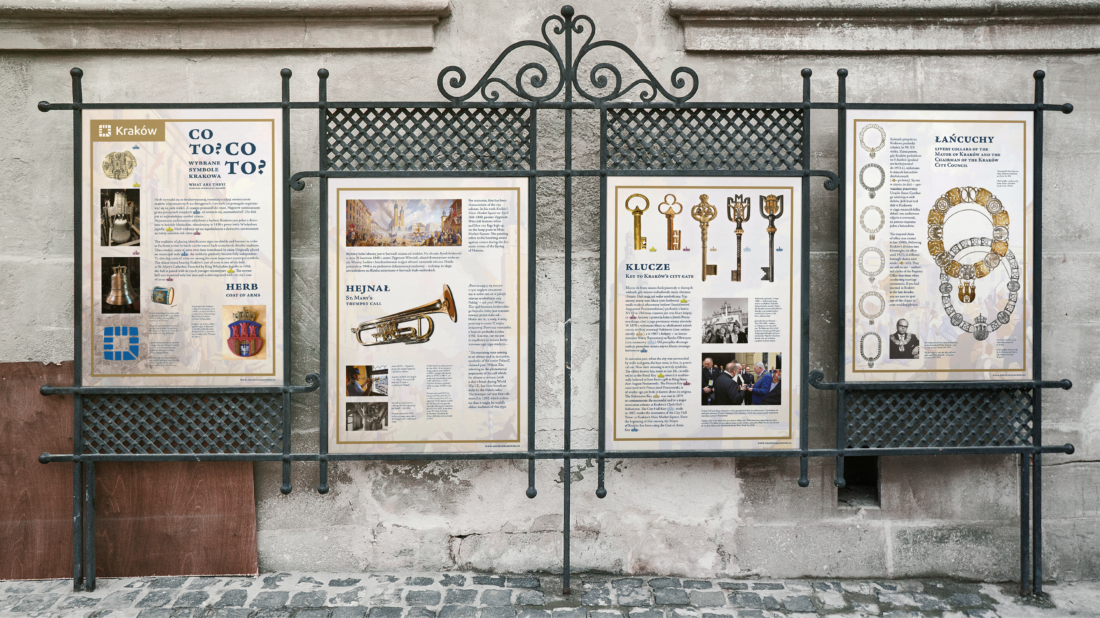
The publication later extended into a public exhibition installed in front of the Kraków City Hall, at the seat of the Mayor’s Office.
The exhibition translated the book’s visual and editorial principles into a spatial format, introducing the publication and its historical content to a wider audience.
The exhibition translated the book’s visual and editorial principles into a spatial format, introducing the publication and its historical content to a wider audience.