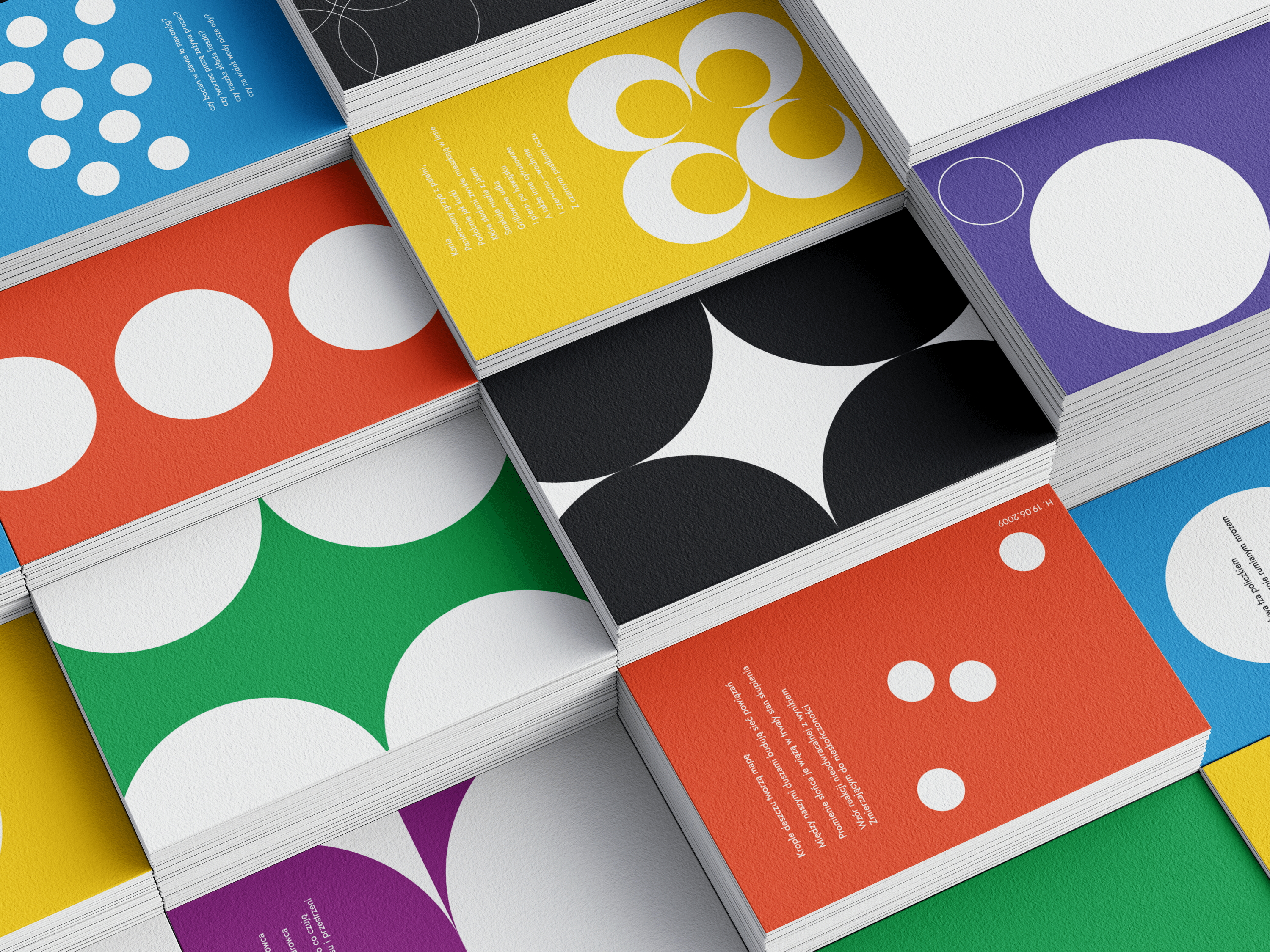
Challenge
To create a visual identity for a lactation clinic operating in a highly saturated, emotionally charged market.
The challenge was to stand out while building clarity, credibility and calm - without relying on stereotypical maternity aesthetics.
Solution
The brand was repositioned around trust, knowledge and evidence-based medical practice.
Art direction focused on shifting the visual language from emotional reassurance to professional competence, offering empathy through clarity rather than sentiment.
Design system
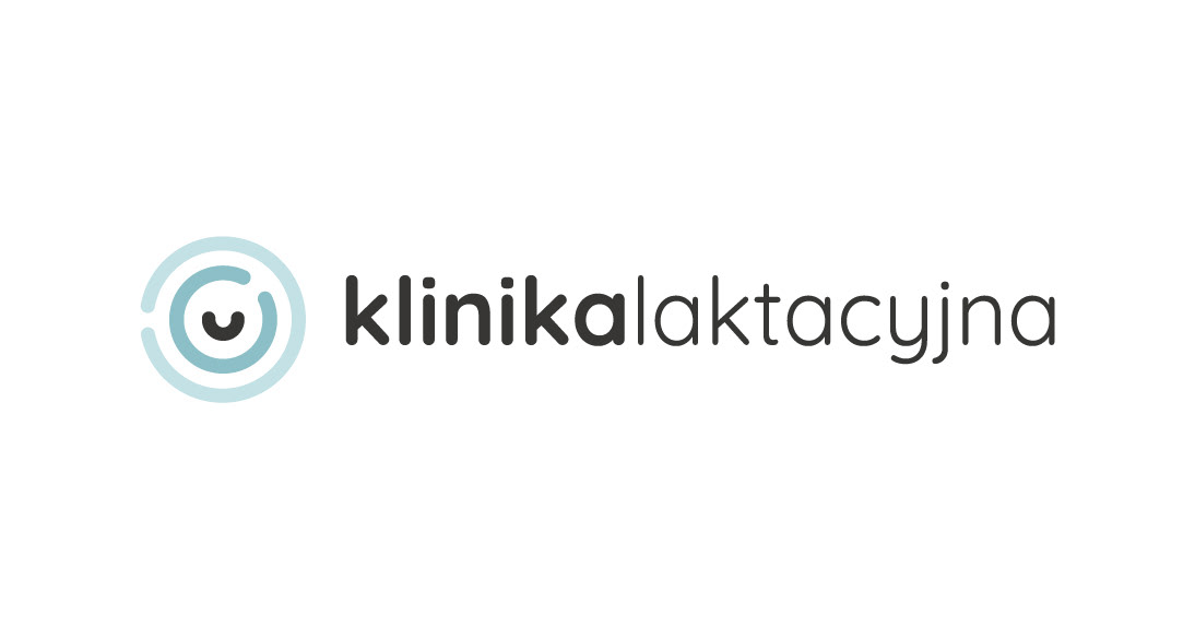
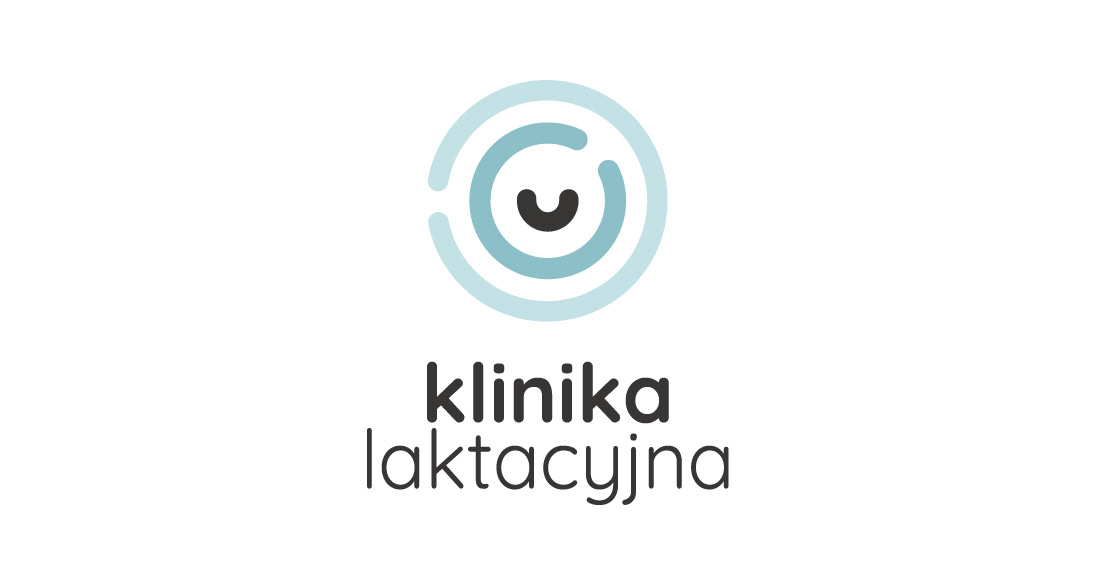
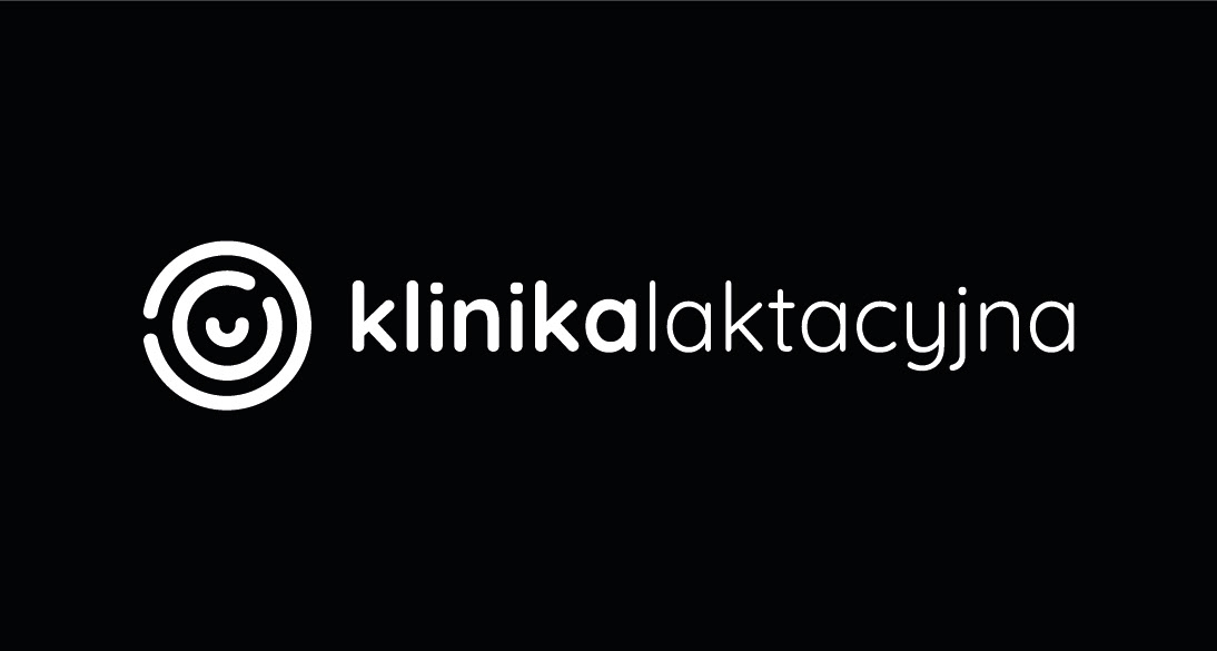
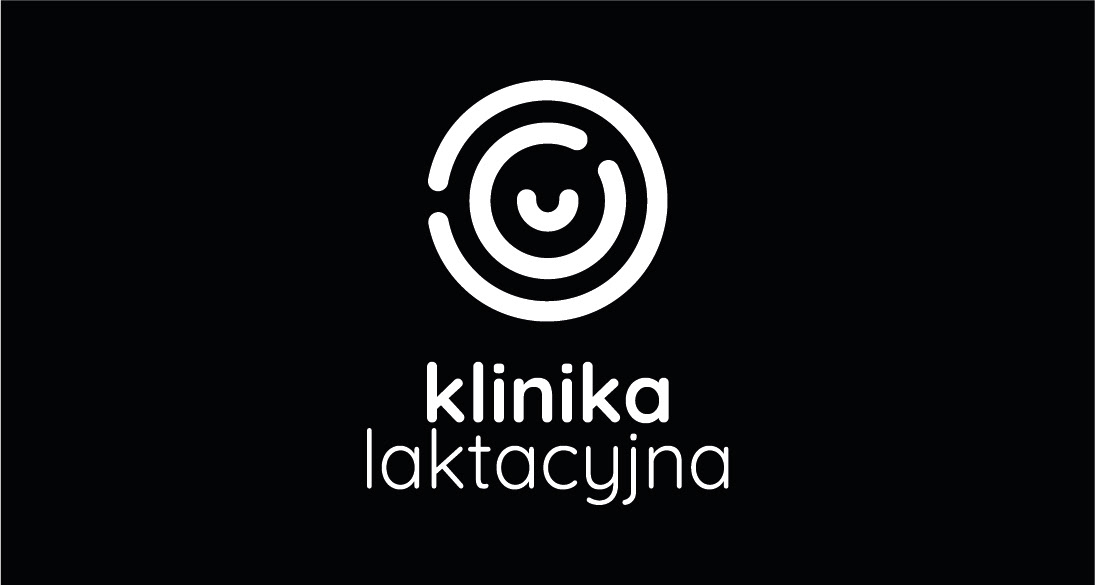
The identity is built on an abstract symbol derived from metaphor and biology, representing guidance, center and support.
Restrained color palette, clear typography and disciplined layout reinforce professionalism while remaining accessible and human.
Outcome
The final identity clearly differentiated the clinic within its market context and was fully adopted across all touch points.
The project demonstrates the ability to challenge category conventions and guide clients toward unfamiliar but more effective visual solutions.
Disciplines
Art Direction, Brand Strategy, Visual Identity Design, Communication Design, Digital & Print