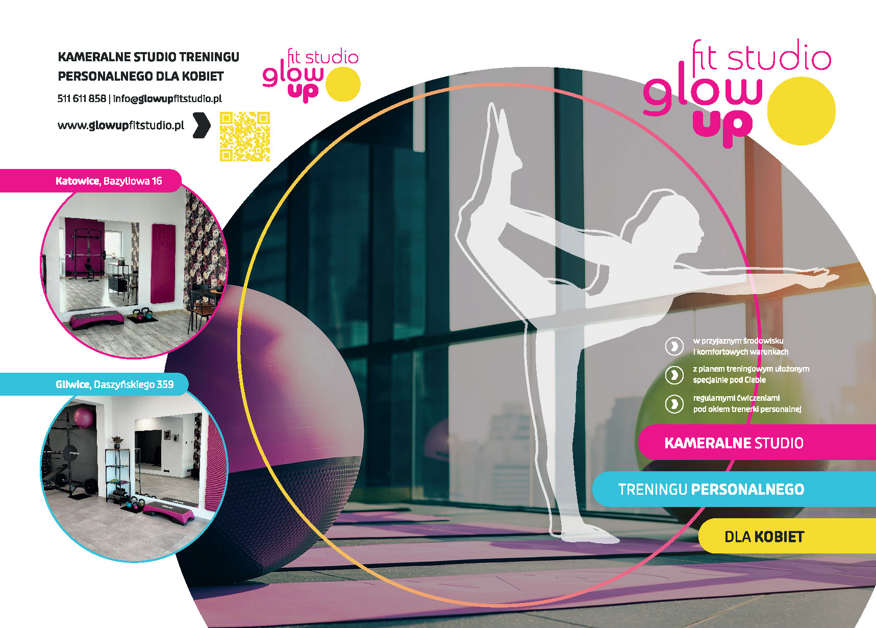
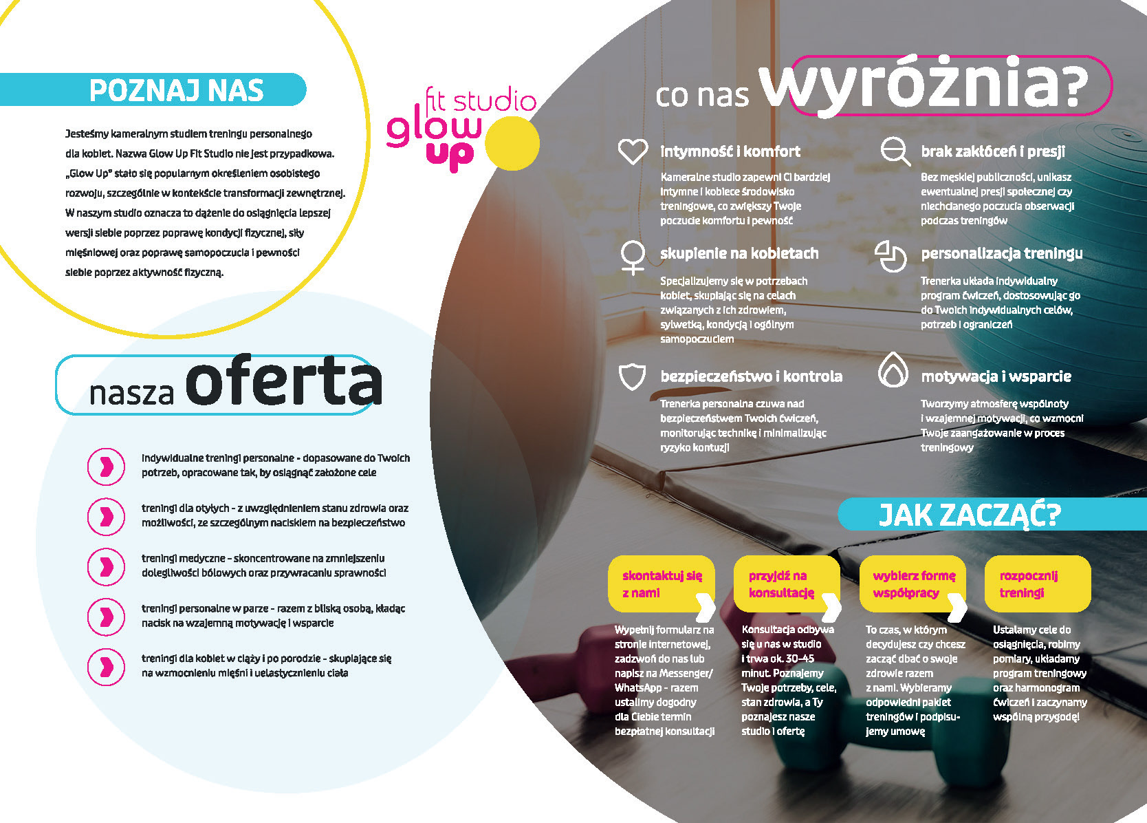
Design Purpose
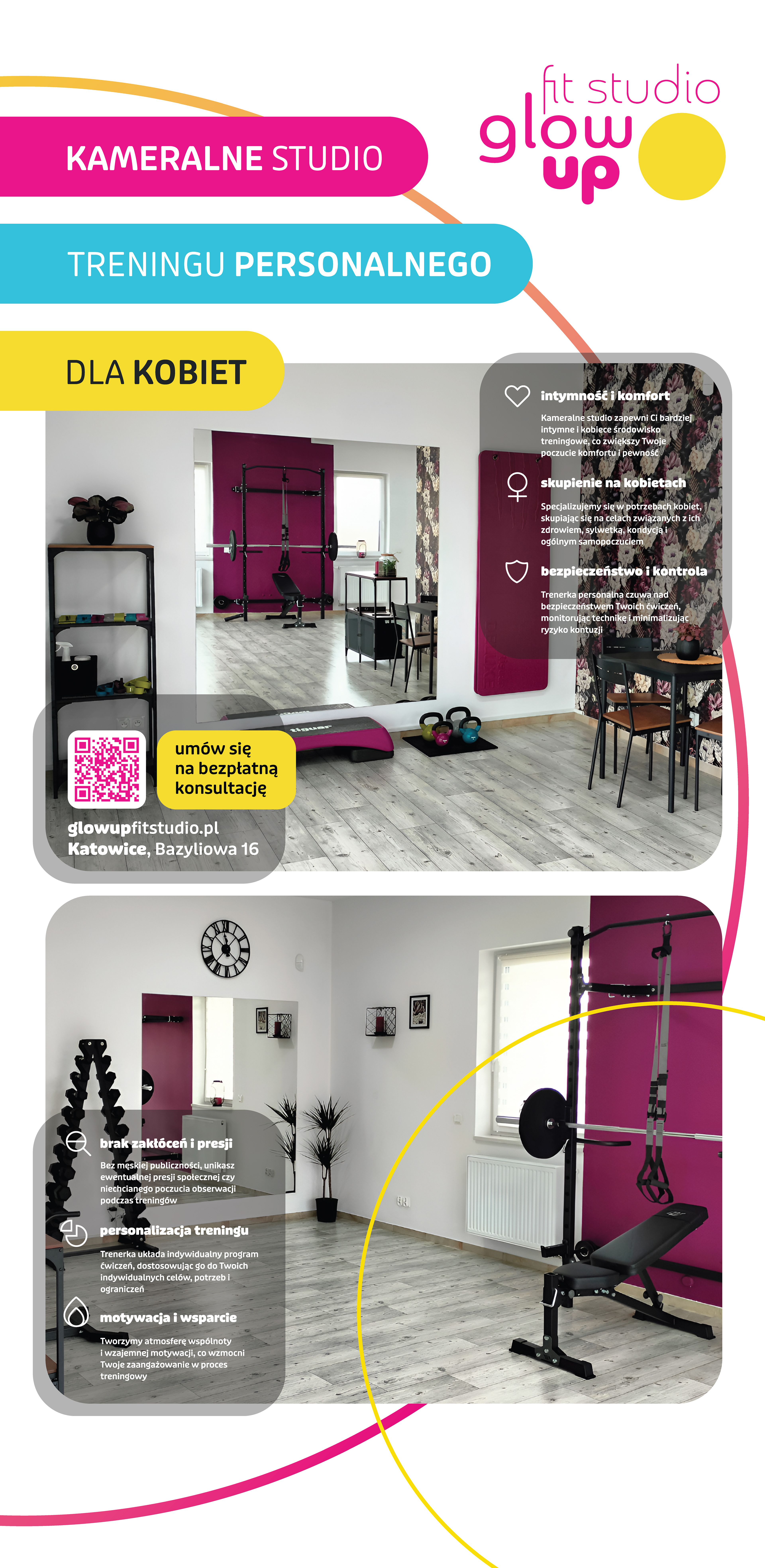
The purpose was to create a visual identity for a women's fitness studio that displays energy and welcoming while remaining consistent and functional in a physical space.
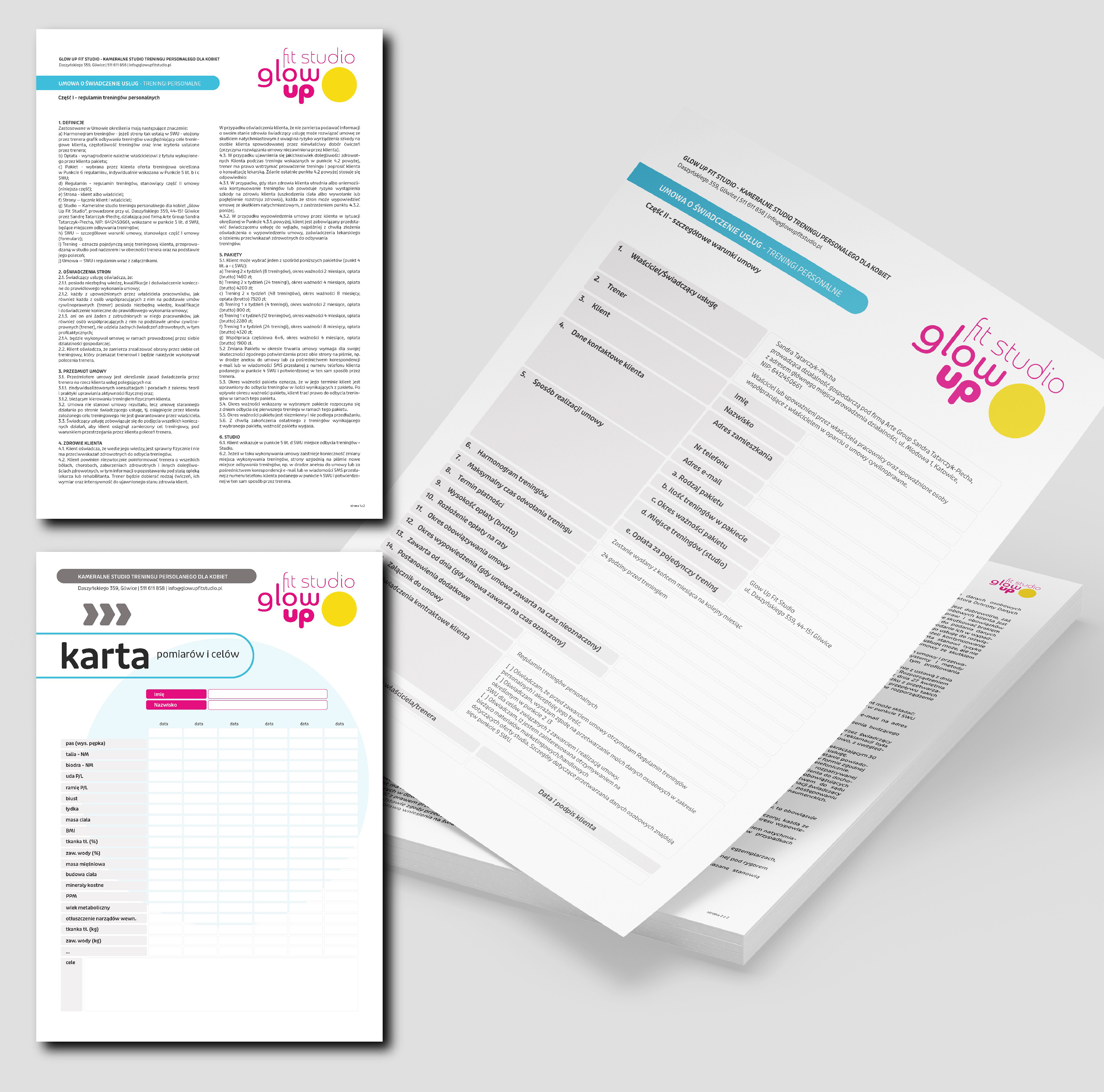
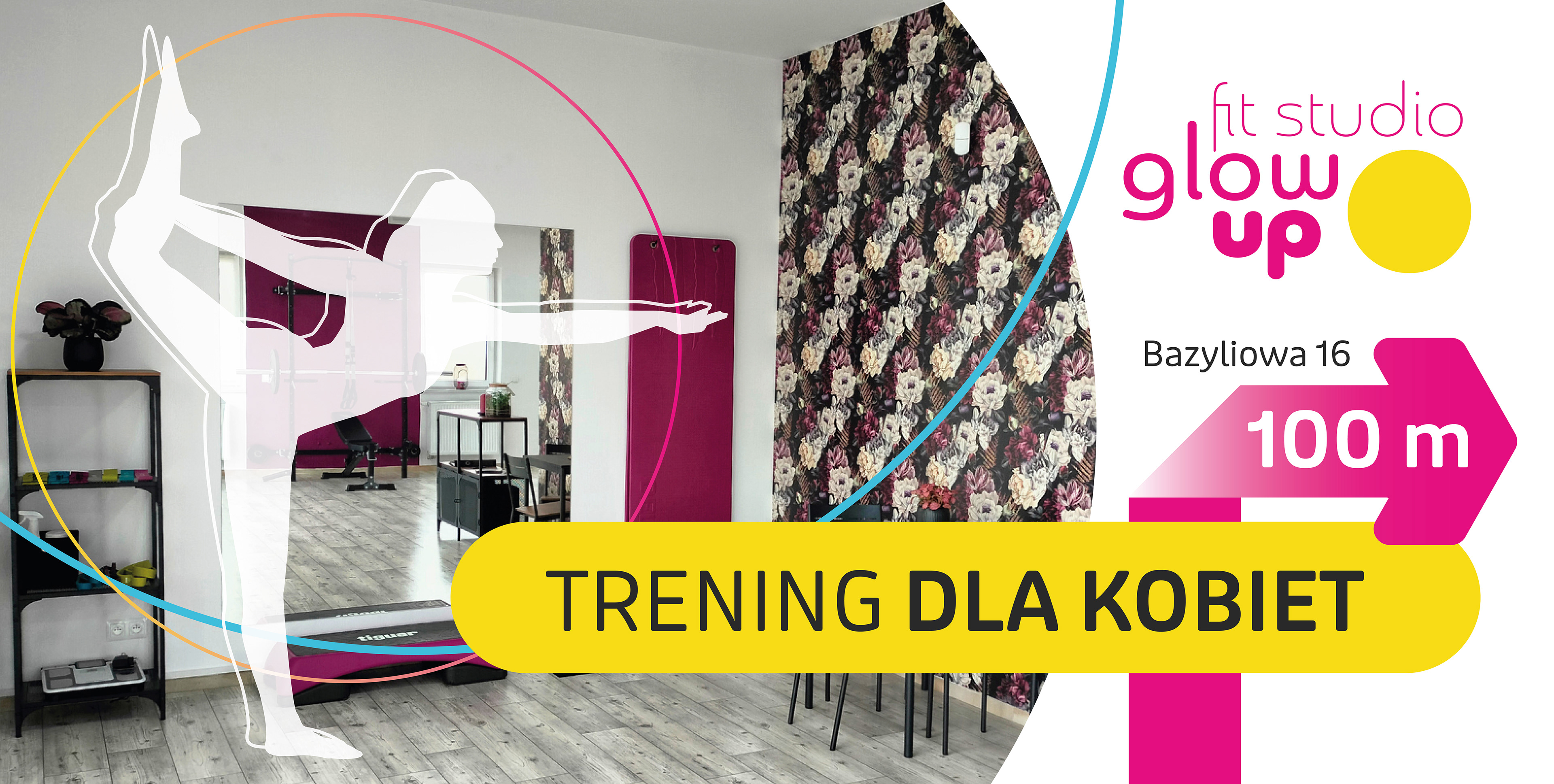
The system needed to work well in print and outdoor formats, and integrate naturally into the studio interior.
Design Approach
The identity was built around bold colors, simple forms, and clear messaging. Instead of a typical “hard fitness” aesthetic, the focus was placed on positive associations, accessibility, and movement.
Design decisions were guided by fast information recognition - both in urban space and across social media.
Visual System
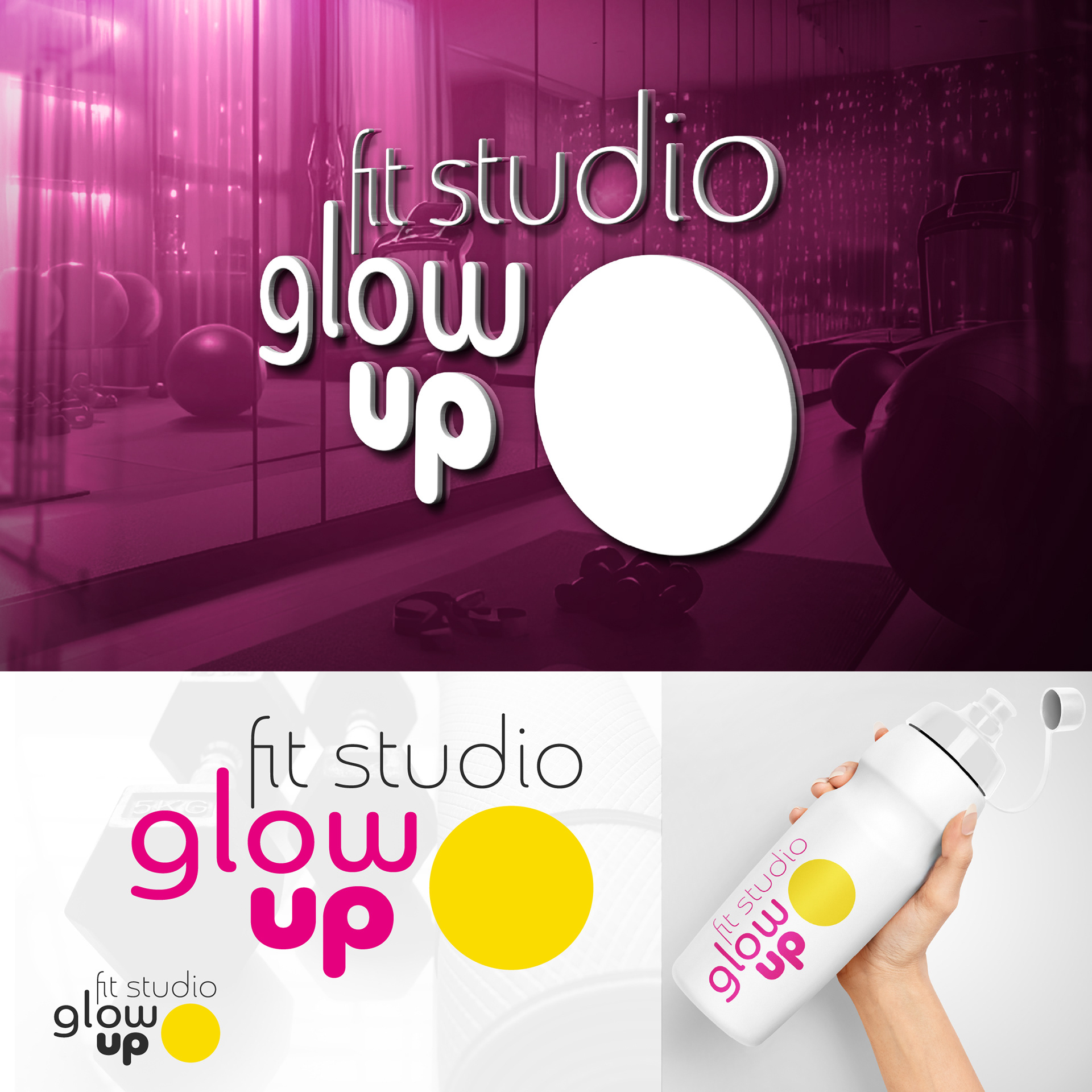
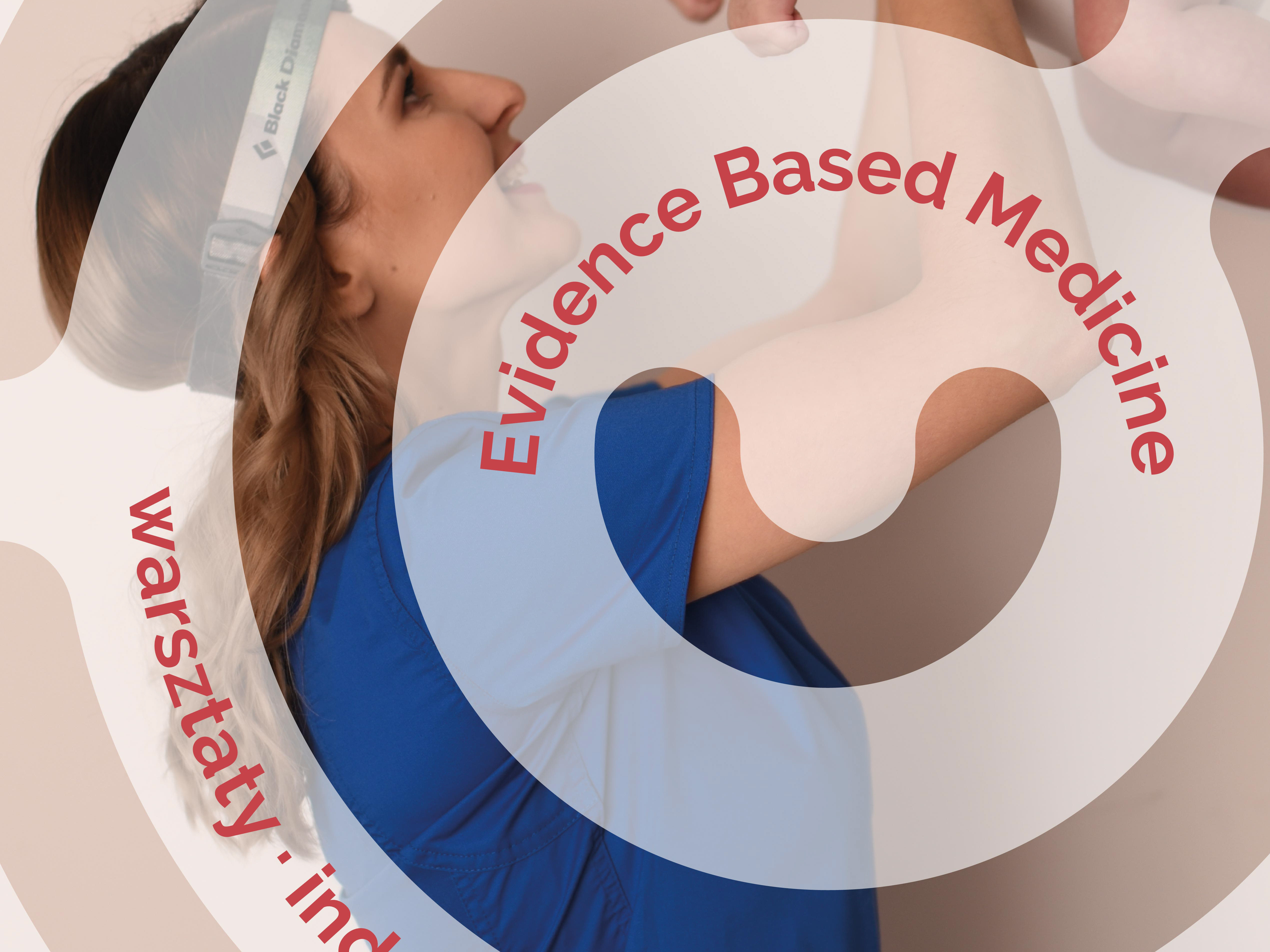
The visual system is based on a high-contrast pink and yellow color palette, communicate energy, visibility, and strong brand awareness.
Geometric shapes and directional arrows organize content and guide the viewer’s attention.
Clean, legible typography supports large-scale formats, print production, and digital use.
The system was designed to be flexible and practical for everyday applications.
Outcome
The result is a cohesive visual identity that functions across the studio interior, printed materials, outdoor signage, and online communication.
The system strengthens the character of the space, supports clear messaging, and creates a friendly, recognizable environment for its audience.
Client Perspective
Owner of Glow Up Fit Studio: During my collaboration with Agnieszka, what I valued most was her professional approach to the project, her exceptional aesthetic sense, and her original, creative ideas. An additional and truly important strength is her empathetic attitude, as well as her ability to listen and fully understand the client’s needs.